Skyloop Design System
PortAventura's app had a component library and a style guide. I built and now own the Skyloop Design System: one token-driven system for app and web, which people and AI agents can both read.
PortAventura World
- Client
- PortAventura World
- Role
- Product designer, design system owner
- Team
- Design lead, product designer (me), development team
- Period
- October 2024 – present
- The problem
- Components lived in an app-only Figma library with 119 colour styles and no variables. Nothing could carry the web, the ticket funnel or a second brand without being redrawn.
- What I did
- I built the component system on tokens and atomic design with the design lead, then led its move into AI: auditing the library, documenting every component for people and agents, and prototyping in code with our own components.
- The outcome
- Three products run on it today and seven more are on the way. A flow that took three to four weeks to get approved now reaches stakeholders in two days.
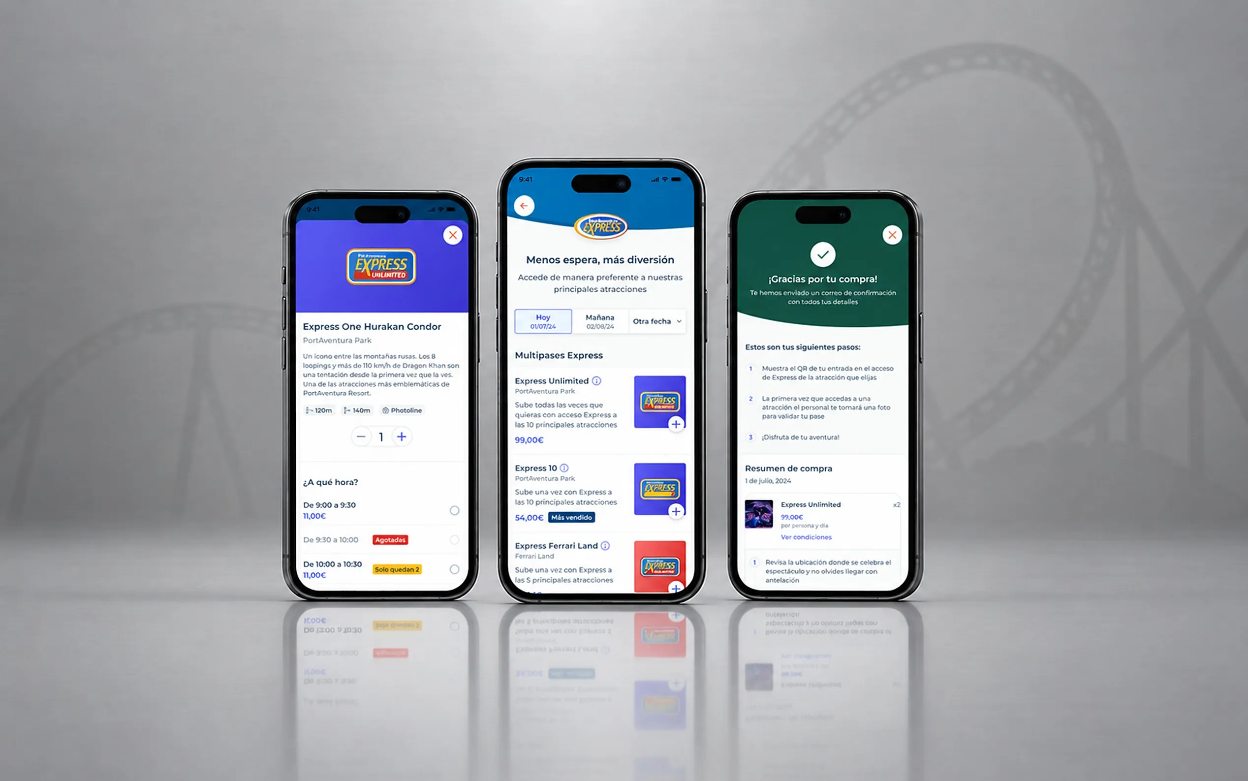
The Skyloop Design System is how PortAventura World builds its digital products: the app, the purchase funnels and, soon, the website, hotels and private area. It started in October 2024, when the app’s extras funnel moved to the web, and I’ve owned it since. In the first year I led the component system while the design lead set up the tokens; today the design lead coordinates with development, QA and stakeholders, and I look after the system itself.
The problem
Before Skyloop, the app had a component library and a style guide. Everything sat on one Figma page, in groups with names like “Frame 427318808”. Each component was a board of hand-made variations, several of them marked “pending review”, with deprecated versions kept underneath. Every colour and text decision was a style: 119 colour styles, 30 text styles and no variables at all.
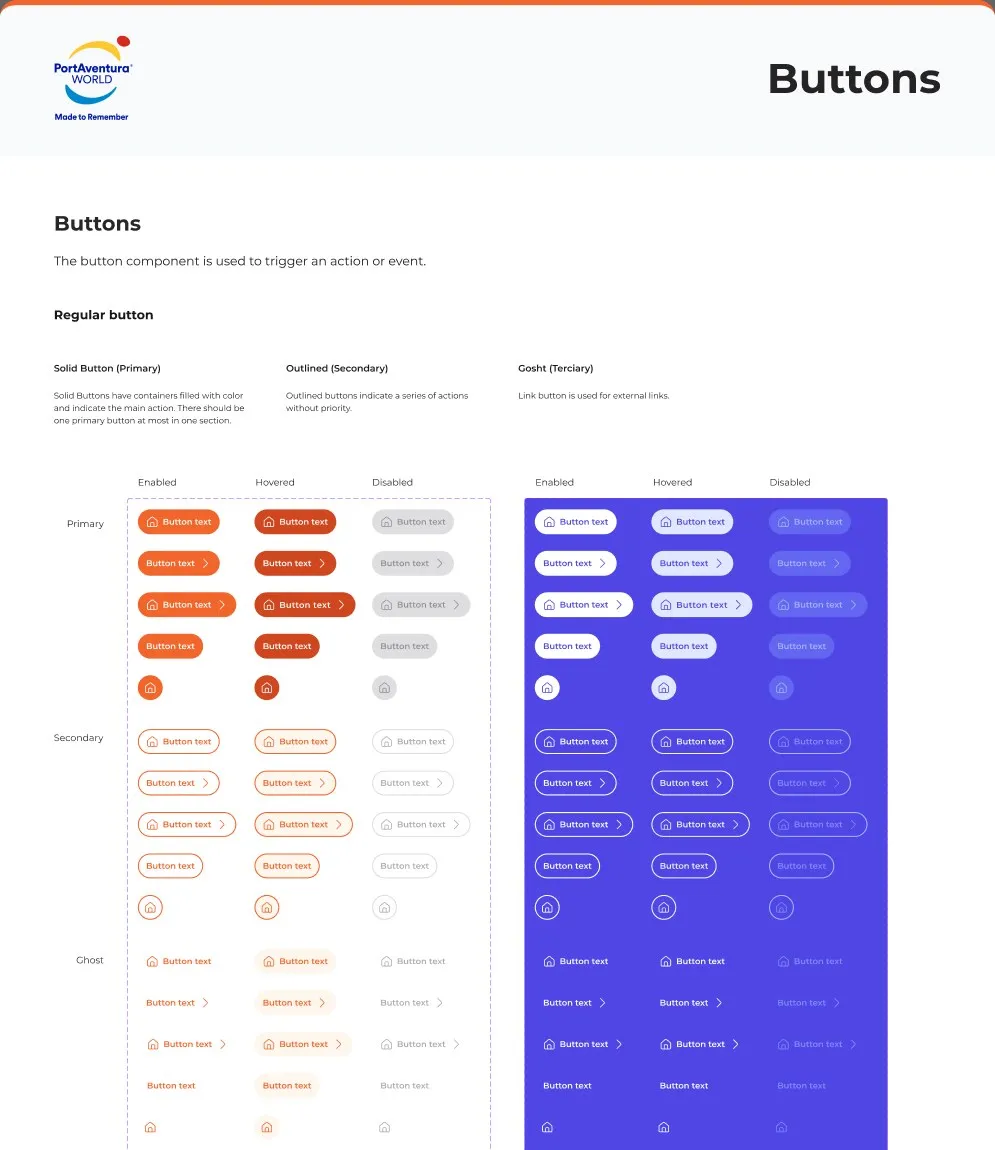
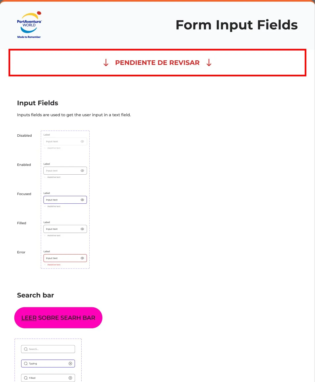
That worked for one app. It couldn’t work for what came next. The extras funnel was moving from React Native to the web, and the plan was to carry the ticket funnel, the website, the private area and the hotels on the same foundations, for three brands: PortAventura Park, Ferrari Land and the Ponient hotels. With styles, every new brand or product meant redrawing components by hand.
Constraints
The system was born squeezed between very large deliveries. The extras funnel and then the ticket funnel needed components on a deadline, so we built what each release needed and structured it as we went.
It also had to look like PortAventura from day one. The company had years of screens behind it, and a new system that looked foreign next to the old app wasn’t an option.
And it had to serve two platforms and several teams. React on the web, React Native in the app, several development teams, and later an external consultancy designing landings.
Decisions
Store every decision as a token, not a style
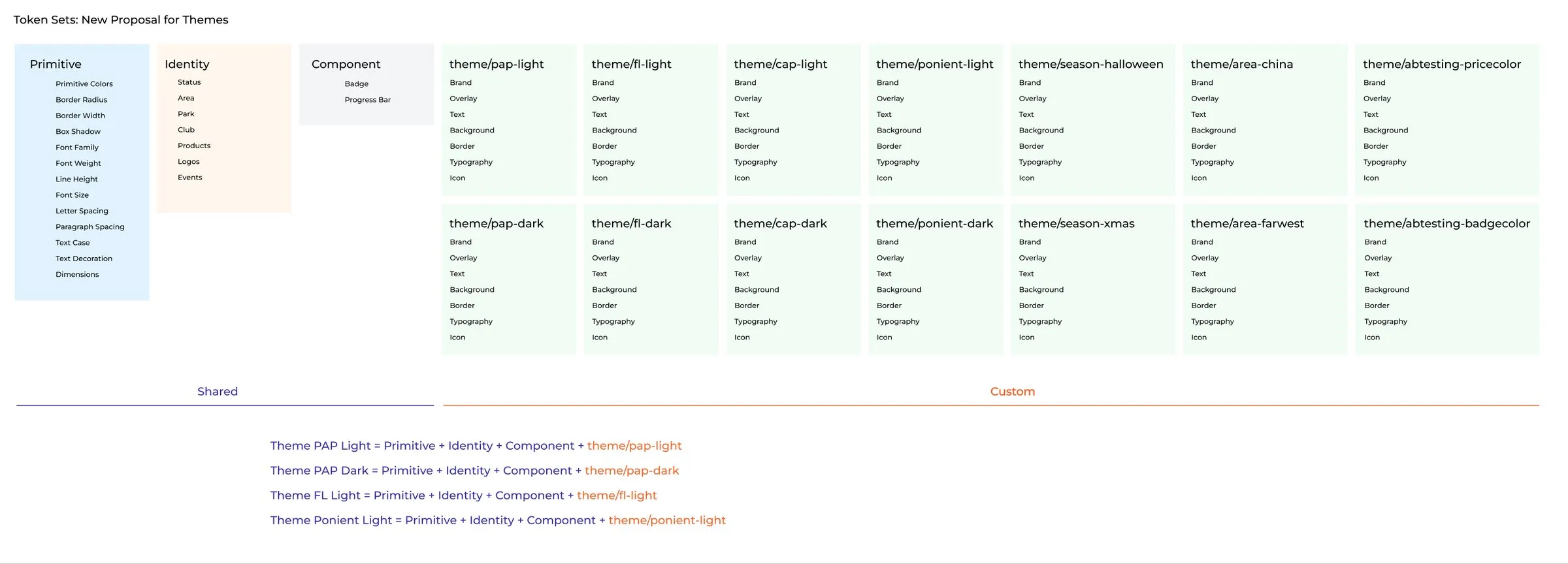
The first decision was structural. Instead of styles, every colour, radius, spacing and type decision became a token, organised in layers: primitives, then identity (status, park, area, products), then the theme, then the component. In Figma they live as 421 variables with one mode per theme; in code, Token Studio and Style Dictionary turn the same JSON into CSS variables.
What we gained is that a brand became a set of values, not a set of components. PortAventura Park, Ferrari Land and Ponient, light and dark, all run on the same components. The structure we’re proposing now goes further: themes for seasons like Halloween and Christmas, for park areas, and even for A/B tests, each one a new layer on top of the shared ones.
One atomic system for the app and the web
The second was scope. Skyloop wasn’t going to be the web version of the app library; it would be one system for every product, organised by atomic design, from foundations to atoms, molecules, organisms and key screens. Each component has its own page in Figma and its own story in Storybook.
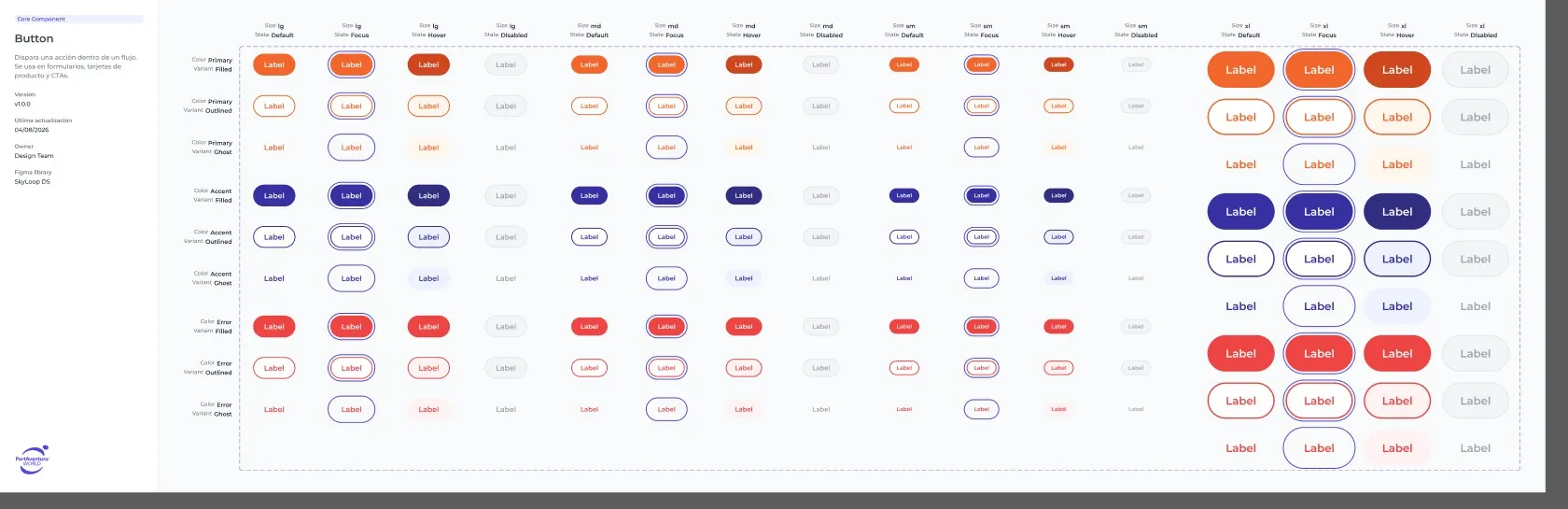
The ticket funnel was the first big test. Its launch in 2026 brought a wave of new components, and between February and May the developers pushed over a thousand commits to the shared packages, the biggest build-out in Storybook so far. Three products run on the system today: the app, the extras funnel and the ticket funnel. Landings, hotels, the private area, the Club pass funnel, ticket cancellation, online check-in and restaurant booking are on the way.
Make the system readable by people and by AI
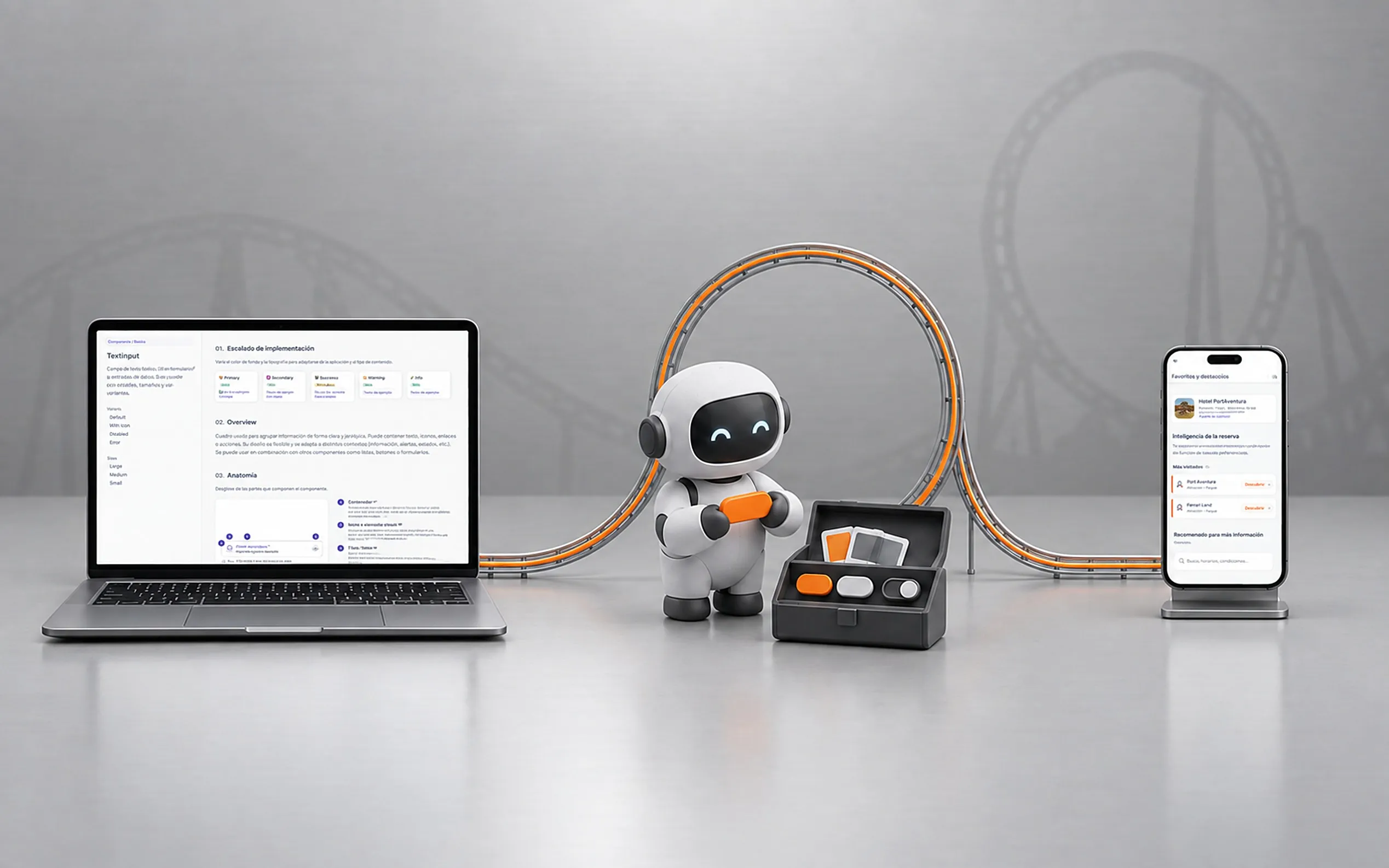
The third decision is the one I’m working on now. Over the last five or six months, AI has become part of how we design, and a design system now has two readers: the people who use it and the agents that write code and screens from it. Both need the same thing, a system they can trust. I’m working on it along three lines.
Audit. With Claude Code and the Figma MCP, I audited the library and the tokens against the code. The first finding set the tone: of the first three components I checked, two were documented wrong. From then on, every claim in our documentation is marked as verified or inferred.
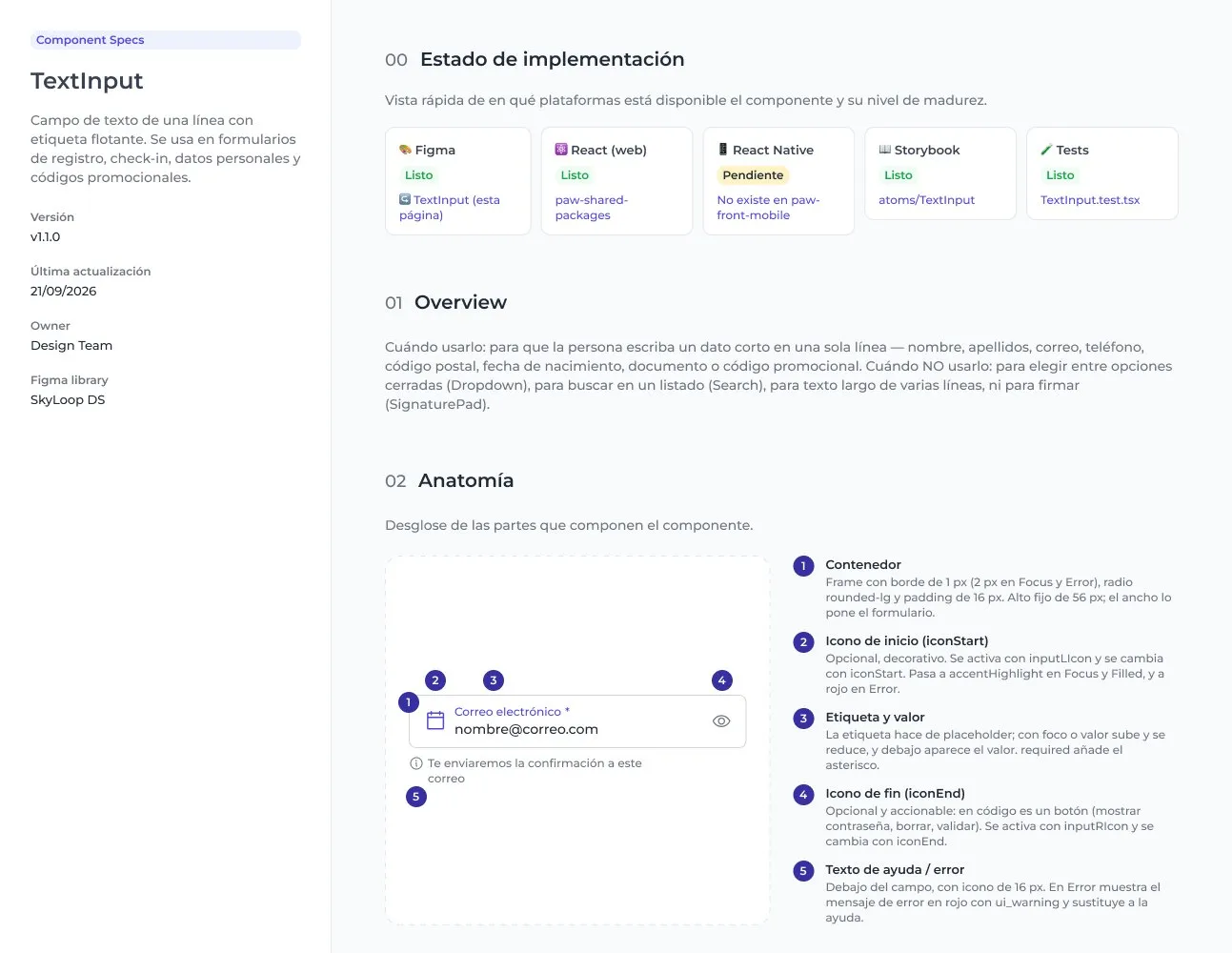
Document for both readers. Every component gets a spec that people and agents can read: when to use it, anatomy, variants, states, props, accessibility, tokens and a technical identity that links the Figma node, the code component and its Storybook story. Next to it, a register lists every mismatch between Figma and code, and whether it’s design work or code work.
| Component | Figma | Code | What to do |
|---|---|---|---|
| TextInput | 20 px end icon | 24 px | Move the icon to medium |
| Dropdown | — | onBlur never runs, because the error is passed as '' | Pass undefined when there’s no error |
| Dropdown | — | Options have no aria-selected | Add it to the selected option |
Many of the fixes are small, like one Badge instead of several, elevation moved from the components to their containers, or a single grammar for naming variants. Each one alone looks minor. Together they mean we can now change large parts of the system without a large development cost.
Prototype with the real system. For new flows, we now build interactive prototypes in code, on our own tokens, before we design anything in Figma. They look and behave like the product, so we can test them with guests and with synthetic users and show them to stakeholders straight away. This is the online check-in prototype, with two ways of registering guests. Tap through it; it’s the real thing.
None of this replaces the method. We still work in a double diamond, and when we need to invent a new component, step outside the usual patterns or explore, we still start with wireframes. AI makes us faster at prototyping and at keeping Figma and code in sync. It doesn’t do the research or the thinking for us.
Where it’s going
The next step is to make the loop between Figma and code run both ways. The field is converging on the same pieces: design tokens now have a stable W3C standard, Figma’s MCP server and Code Connect let agents read components as they really are, and machine-readable formats like the Design System Doc Spec serve people and agents from one file. What still has no reliable answer is keeping component structure in sync, and that’s exactly the gap we’re working on.
I think about it in four layers:
- Sync: tokens aligned between Figma and code.
- Document: docs generated from the real source.
- Validate: the system’s rules checked automatically, like a spacing off the scale or a duplicated variant.
- Discover: find the component that exists before inventing a new one.
For a developer, that answers the questions they ask every week. Is there a component for this? In seconds, in their editor, with example code. Is this documentation current? If the code changes, the documentation finds out first. Why is this padding 14 px here and 16 px there? It wasn’t on purpose, and the system will have caught it before they do.
Result
A flow used to take three to four weeks from the first screens to approval, through wireframes, benchmarks and rounds of review. Now we can put several versions of a flow in front of stakeholders in two days, as prototypes that already work, and move the chosen one to Figma. That’s my estimate rather than a measurement, but it’s the change the whole team feels most.
Three products run on the Skyloop Design System today, seven more are on the way, and each one arrives with less to build than the last. What I enjoy most is how much of the back-and-forth has gone, with development and with PortAventura’s stakeholders: we agree on a flow by using it, not by describing it.
What I’d do differently
I’d put accessibility at the centre from the first day. To keep the new system from looking foreign next to the old one, we carried over practices the company had used for years, and with them some wrong ones, especially contrast. The system was born limping when it could have started on the right foot.
I’d set contribution rules for outside teams before they arrive. For the landings, another consultancy designed its own component library without following ours, and adapting it to the system took a lot of work. A design system has to be easy to follow for people who don’t use it every day, and clear about what isn’t optional.
And I’d build the foundations before the deadline arrives. We created the tokens by hand between large deliveries, and AI is now correcting a lot of that debt. The main thing I’ve learned is that when the foundations are solid, scaling almost takes care of itself.
- 2 daysfrom the first screens to an approved flow, down from three to four weeks (my estimate)
- 3 → 10products on the system today, and with the ones already on the way
- 132components in code, from atoms to templates, on 421 design variables